How These Figures Were Determined
"Current military" includes Dept. of Defense ($707 billion) and the military portion from other departments as noted in current military box above ($162 billion). "Past military" represents veterans' benefits plus 80% of the interest on the debt.* For further explanation, please go to www.warresisters.org.
These figures are from an analysis of detailed tables in the Analytical Perspectives book of the Budget of the United States Government, Fiscal Year 2012. The figures are federal funds, which do not include trust funds -- such as Social Security -- that are raised and spent separately from income taxes. What you pay (or don't pay) by April 18, 2011, goes to the federal funds portion of the budget. The government practice of combining Trust and Federal funds began during the Vietnam War, thus making the human needs portion of the budget seem larger and the military portion
smaller.
*Analysts differ on how much of the debt stems from the military; other groups estimate 50% to 60%. We use 80% because we believe if there had been no military spending most (if not all) of the national debt would have been eliminated.
THE GOVERNMENT'S DECEPTION
This pie chart below is the government view of the budget.
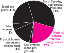
Federal Outlays for FY 2009
This is a distortion of how our income tax dollars are spent because it includes Trust Funds (e.g., Social Security), and the expenses of past military spending are not distinguished from nonmilitary spending. For a more accurate representation of how your Federal income tax dollar is really spent, see the large graph.